Using Python to Understand Data: A DBAs Perspective
-
Posted by Quest Customer Learning Team
- Last updated 5/30/23
- Share

By Rohith Solomon | Edited by Arup Nanda
Recent years have shown an upshift of open source technologies with an evident increase in hybrid applications from licensed and proprietary tools. One such popular technology is Python programming language, which has made its way to the top. Most of its popularity can be attributed to the variety of options it provides for visualization and machine learning alongside the application development and automation. This article will primarily focus on how Python’s graphing libraries can be used to understand data from a database administrator’s (DBA’s) perspective.
Tools to Create Meaningful Stories
A large open source community means a ton of libraries are being developed and shared. This leads to experimentation and development of a variety of visualization libraries supported by Python. The libraries range from basic statistical graphs to interactive, multi-dimensional and geographical models. To name a few,
- Matplotlib – Foundation of Python plotting
- Seaborn – An enhanced plotting library built on top of Matplotlib
- Plotly – A library for interactive plotting
The list could go on – however, these three should be sufficient to generate different graphs for DBAs.
It is rare that data can be fed directly to the visualization libraries. Just a few data characteristics that must be accounted for and cleaned up include missing data/null values or date/time types depending on our requirements. Data pre-processing can be done using the two libraries shown below:
- Numpy – for scientific computing
- Pandas – data structure for data analysis
Together, these two sets of libraries can extract, analyze and plot the data in various combinations, hiding the intricacies under the hood and making a programmer’s life easier.
Cleaning the Data
Why clean the data before analyzing it?
Let’s see a simple example where an outlier in the salary range of the employees, based on their position as a DBA, will alter the statistical values.
Code:
#importing Pandas library for Data Analysis
import pandas as pd
#Creating a test DataFrame using dictionaries
position_salary_dict = {‘Position’:[‘Junior DBA’,’Senior DBA’,’Principal Analyst’,’Architect’,’CEO’],
‘Salary’: [25000,35000,50000,80000,1500000]}
position_salary = pd.DataFrame(position_salary_dict)
position_salary
Output:

# The salary of the C.E.O is way too high and shouldn’t have been added to this DataFrame
position_salary[‘Salary’].mean()
Output:
338000.0
position_salary[position_salary[‘Salary’] < 100000].mean()
Output:
Salary 47500.0
without_CEO_data = position_salary[position_salary[‘Salary’] < 100000] without_CEO_data
Output:

#Importing plotting library
import matplotlib.pyplot as plt
fig,ax = plt.subplots(figsize=(7,7))
plt.boxplot(position_salary[‘Salary’],showmeans=True)
plt.show()
Output:

fig,ax = plt.subplots(figsize=(7,7))
plt.boxplot(without_CEO_data [‘Salary’],showmeans=True)
plt.show()
Output:

The graph clearly shows the mean value of the salaries is significantly higher when the salary of CEO is included and decreases when the salary of CEO is excluded. The salary of CEO is irrelevant in our analysis because we’re trying to analyze the DBA salaries and hence it should be excluded to get the correct results.
Similarly, an invalid date/time format might result in an incorrect graph, or a NaN value (Not A Number) can mislead the analysis. Most of the data analysis work is concentrated toward cleaning data. The complexity of this process completely depends on the input data and the purpose of analysis.
Analyzing Data
Input data can ship in various formats, for instance: XML, HTML, CSV, Excel Sheets, JSON or even a plain text file. Python’s Pandas DataFrames can digest any popular data type, allowing us to work with a variety of datasets.
Suppose we capture performance metrics of the database in an Excel sheet. A typical sequence of steps could be:
- Read the data into a Pandas DataFrame
- Clean the data per the requirement
- Transform the data into a pivot table or a graph
The data can be further subjected to statistical analysis. If it is a use case suitable for machine learning, appropriate algorithms can be applied to create a machine learning model to predict or classify the data. This is an offline analysis.
Python Oracle Database Connection
The Python DB API 2.0 cx_Oracle is used to connect to Oracle databases and perform Data Manipulation Language (DML) and Data Definition Language (DDL) operations along with bulk transactions. Once the connection between the Python application and the database is established, data can be pulled into the Python code to perform analysis dynamically and generate graphs per the requirement. The connection to the database is maintained during the data ingestion and then closed when completed.
Python code can be executed from the command prompt (CLI) or from the Integrated development environment (IDE) to make things easier. We can even use Python distributions like Anaconda, which can be found at https://anaconda.org/. This ships with most popular libraries. We don’t have to explicitly install the popular libraries. It also lets us install any new libraries per our requirement.
All the examples included in this article were done using Anaconda and Jupyter Notebook IDE which can be found at https://jupyter.org/. This is best suited for data analysis. There are many other popular IDEs to choose from, including PyCharm, Spyder and Atom.
Use Cases
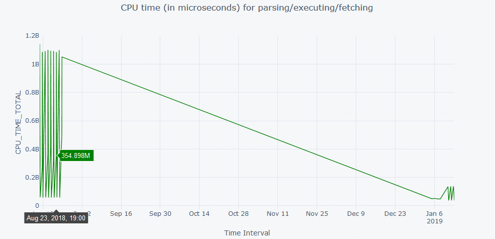
Many times DBAs are required to analyze the performance of a particular Structured Query Language. (SQL). In this case, I am connecting to my Oracle database from the Python application and fetching the data required directly into the Pandas DataFrame to generate the graphs.
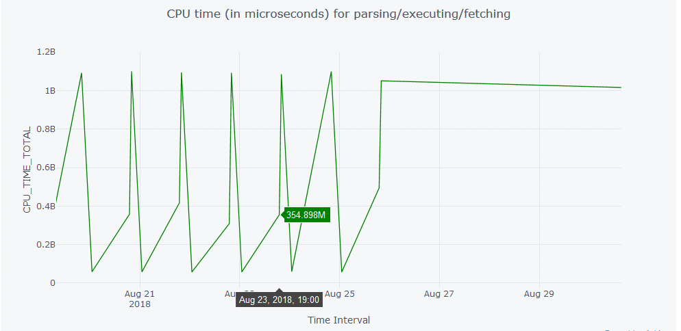
The CPU time of the particular SQL being analyzed is plotted using Plotly library in Python. Hovering the cursor anywhere over the graph will display the data plotted at that particular data point as shown in Figure 1. It further improves the visibility by offering a zoom in and zoom out option as shown in Figure 2.
Line Graph
Code:
import cx_Oracle
import pandas as pd
%matplotlib inline
#Code to connect to Oracle Database and fetch the data into Pandas DataFrame
try:
con = cx_Oracle.connect(‘python/[email protected]/XE’)
print (“The number of days to go back to search for the history: For example: \n1=yesterday\n2=day before yesterday \
\n0=today”)
past_date = input()
print(“Chosen days to search:”, past_date)
print(“Enter the \”SQLID\” to search”)
sql_id = input()
sql=”’select a.SNAP_ID,a.FETCHES_TOTAL, a.SORTS_TOTAL, a.LOADS_TOTAL,
a.PARSE_CALLS_TOTAL, a.DISK_READS_TOTAL, a.BUFFER_GETS_TOTAL,
a.CPU_TIME_TOTAL, a.ELAPSED_TIME_TOTAL, a.IOWAIT_TOTAL,
a.CLWAIT_TOTAL, a.APWAIT_TOTAL, a.CCWAIT_TOTAL,
a.DIRECT_WRITES_TOTAL,
a.PHYSICAL_READ_REQUESTS_TOTAL, a.PHYSICAL_READ_BYTES_TOTAL, a.PHYSICAL_WRITE_REQUESTS_TOTAL,
a.PHYSICAL_WRITE_BYTES_TOTAL,b.BEGIN_INTERVAL_TIME,b.END_INTERVAL_TIME
from dba_hist_sqlstat a, DBA_HIST_SNAPSHOT b
where a.snap_id = b.snap_id
and a.sql_id like ‘%s’
and trunc(b.end_interval_time) <= TO_DATE(sysdate)
AND trunc(b.begin_interval_time) >= TO_DATE(sysdate-%s)
order by BEGIN_INTERVAL_TIME”’ %(sql_id,past_date)
cursor = con.cursor()
df1 = pd.read_sql_query(sql,con)
except cx_Oracle.DatabaseError as exc:
err, = exc.args
print(“Oracle-Error-Code:”, err.code)
print(“Oracle-Error-Message:”, err.message)
finally:
cursor.close()
con.close()
Output:
The number of days to go back to search for the history: For example:
1=yesterday
2=day before yesterday
0=today
1000
Chosen days to search: 1000
Enter the “SQLID” to search
g0zzzda356y2t
import cufflinks as cf
cf.go_offline()
df1.iplot(y=’CPU_TIME_TOTAL’, x=’BEGIN_INTERVAL_TIME’,
color=’green’,xTitle=’Time Interval’,
yTitle=’CPU_TIME_TOTAL’,title=’CPU time (in microseconds) for
parsing/executing/fetching’);
Spread Graph
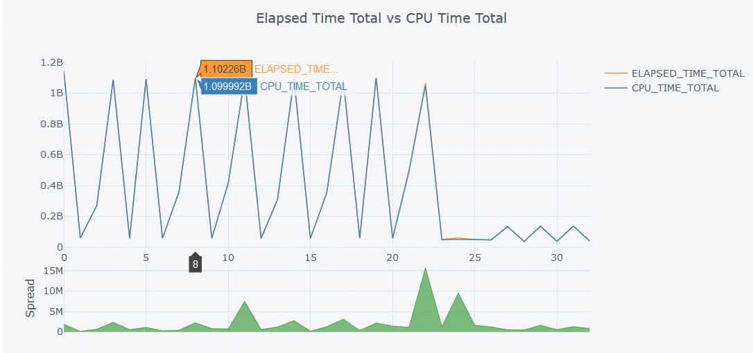
Another useful graph is a spread graph where multiple attributes are compared and the difference between the attributes is plotted as a positive or negative spread. Similar to the graphs shown above, hovering over the graph shown in Figure 3 will display the data values at that particular data point in the graph. To create the graph we do the following:
- We establish a connection with the Oracle database installed on the local machine
- Fetch the data into the Pandas DataFrame
- Close the connection once the data ingestion is completed.
- Plot the graph
The entire code is encapsulated inside the try, except and finally blocks to capture any unwanted errors generated during the process. The connectivity can further be extended over the network by making use of appropriate connection string and network configuration.
Code:
import cx_Oracle
import pandas as pd
%matplotlib inline
#Code to connect to Oracle Database and fetch the data into Pandas DataFrame
try:
con = cx_Oracle.connect(‘python/[email protected]/XE’)
print (“The number of days to go back to search for the history: For example: \n1=yesterday\n2=day before yesterday \
\n0=today”)
past_date = input()
print(“Chosen days to search:”, past_date)
print(“Enter the \”SQLID\” to search”)
sql_id = input()
sql=”’select a.SNAP_ID,a.FETCHES_TOTAL, a.SORTS_TOTAL, a.LOADS_TOTAL,
a.PARSE_CALLS_TOTAL, a.DISK_READS_TOTAL, a.BUFFER_GETS_TOTAL,
a.CPU_TIME_TOTAL, a.ELAPSED_TIME_TOTAL, a.IOWAIT_TOTAL,
a.CLWAIT_TOTAL, a.APWAIT_TOTAL, a.CCWAIT_TOTAL,
a.DIRECT_WRITES_TOTAL, a.PHYSICAL_READ_REQUESTS_TOTAL,
a.PHYSICAL_READ_BYTES_TOTAL, a.PHYSICAL_WRITE_REQUESTS_TOTAL, a.PHYSICAL_WRITE_BYTES_TOTAL,b.BEGIN_INTERVAL_TIME,b.END_INTERVAL_TIME
from dba_hist_sqlstat a, DBA_HIST_SNAPSHOT b
where a.snap_id = b.snap_id
and a.sql_id like ‘%s’
and trunc(b.end_interval_time) <= TO_DATE(sysdate)
AND trunc(b.begin_interval_time) >= TO_DATE(sysdate-%s)
order by BEGIN_INTERVAL_TIME”’ %(sql_id,past_date)
cursor = con.cursor()
df1 = pd.read_sql_query(sql,con)
except cx_Oracle.DatabaseError as exc:
err, = exc.args
print(“Oracle-Error-Code:”, err.code)
print(“Oracle-Error-Message:”, err.message)
finally:
cursor.close()
con.close()
Output:
The number of days to go back to search for the history: For example:
1=yesterday
2=day before yesterday
0=today
1000
Chosen days to search: 1000
Enter the “SQLID” to search
g0zzzda356y2t
#Code to generate the Spread Graph
import cufflinks as cf
cf.go_offline()
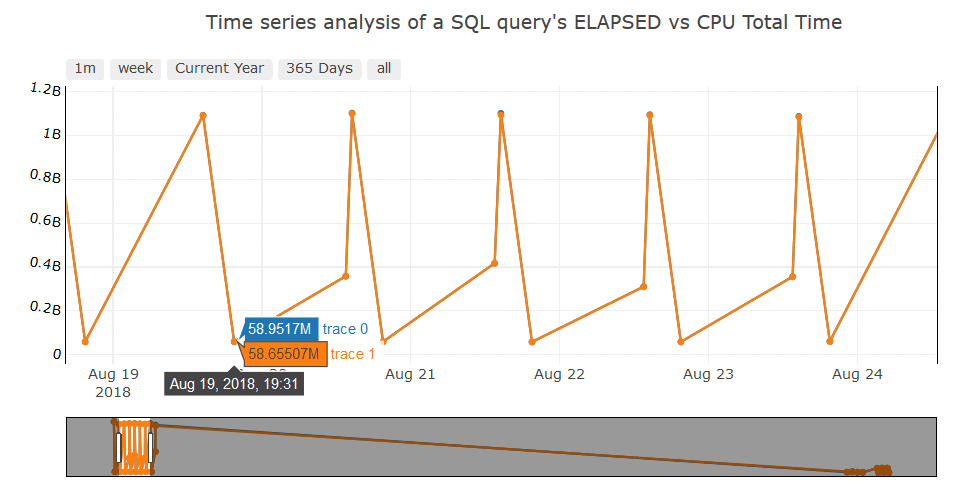
df1[[‘ELAPSED_TIME_TOTAL’,’CPU_TIME_TOTAL’]].iplot(kind=’spread’,title=’Elapsed Time Total vs CPU Time Total’)
Time Series
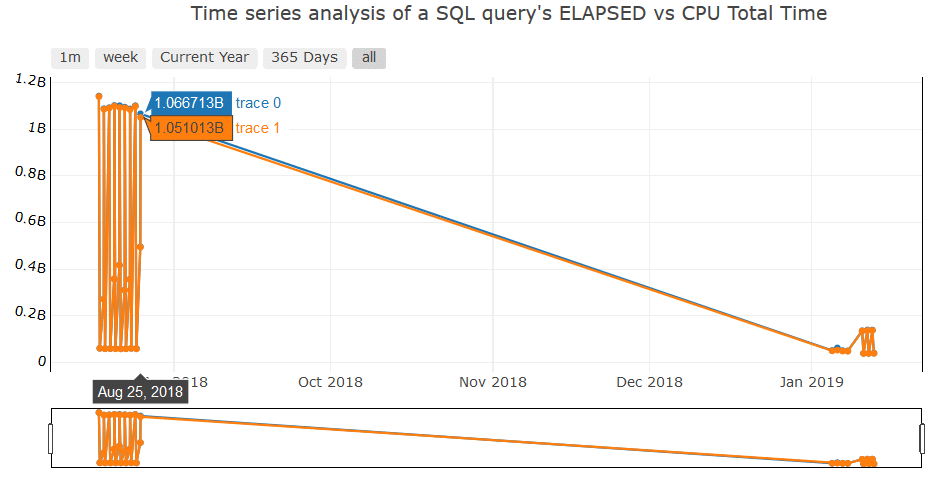
A more complicated (but useful) graph is a Time Series graph with an option to choose the range of dates in various ways, such as fetching the data of a particular week. As shown in Figure 4, the buttons at the top of the graph will let us choose what to display. And the Range Slider beneath the graph is another way to choose any date range just by pulling the left or right slides, as shown in Figure 5. This feature is in addition to zoom in and zoom out option offered by the library by default.
Code:
import cx_Oracle
import pandas as pd
%matplotlib inline
#Code to connect to Oracle Database and fetch the data into Pandas DataFrame
try:
con = cx_Oracle.connect(‘python/[email protected]/XE’)
print (“The number of days to go back to search for the history: For example: \n1=yesterday\n2=day before yesterday \
\n0=today”)
past_date = input()
print(“Chosen days to search:”, past_date)
print(“Enter the \”SQLID\” to search”)
sql_id = input()
sql=”’select a.SNAP_ID,a.FETCHES_TOTAL, a.SORTS_TOTAL, a.LOADS_TOTAL,
a.PARSE_CALLS_TOTAL, a.DISK_READS_TOTAL, a.BUFFER_GETS_TOTAL,
a.CPU_TIME_TOTAL, a.ELAPSED_TIME_TOTAL, a.IOWAIT_TOTAL,
a.CLWAIT_TOTAL, a.APWAIT_TOTAL, a.CCWAIT_TOTAL,
a.DIRECT_WRITES_TOTAL, a.PHYSICAL_READ_REQUESTS_TOTAL,
a.PHYSICAL_READ_BYTES_TOTAL, a.PHYSICAL_WRITE_REQUESTS_TOTAL,
a.PHYSICAL_WRITE_BYTES_TOTAL,b.BEGIN_INTERVAL_TIME,b.END_INTERVAL_TIME
from dba_hist_sqlstat a, DBA_HIST_SNAPSHOT b
where a.snap_id = b.snap_id
and a.sql_id like ‘%s’
and trunc(b.end_interval_time) <= TO_DATE(sysdate)
AND trunc(b.begin_interval_time) >= TO_DATE(sysdate-%s)
order by BEGIN_INTERVAL_TIME”’ %(sql_id,past_date)
cursor = con.cursor()
df1 = pd.read_sql_query(sql,con)
except cx_Oracle.DatabaseError as exc:
err, = exc.args
print(“Oracle-Error-Code:”, err.code)
print(“Oracle-Error-Message:”, err.message)
finally:
cursor.close()
con.close()
Output:
The number of days to go back to search for the history: For example:
1=yesterday
2=day before yesterday
0=today
1000
Chosen days to search: 1000
Enter the “SQLID” to search
g0zzzda356y2t
from plotly.offline import download_plotlyjs, init_notebook_mode, plot, iplot
import plotly.graph_objs as go
import cufflinks as cf
init_notebook_mode(connected=True)
cf.go_offline()
range_slider_dict = {‘bgcolor’:(‘white’),’autorange’:True,’bordercolor’:’black’,’borderwidth’:1}
prep_data = go.Scatter(
x = df1[‘BEGIN_INTERVAL_TIME’],
y = df1[‘ELAPSED_TIME_TOTAL’],
mode = ‘lines+markers’,
# name = ‘lines’,
#yaxis = yaxis
)
#print(prep_data)
prep_data2 = go.Scatter(
x = df1[‘BEGIN_INTERVAL_TIME’],
y = df1[‘CPU_TIME_TOTAL’],
mode = ‘lines+markers’,
)
data = [prep_data,prep_data2]
layout = dict(
title=’Time series analysis of a SQL query\’s ELAPSED vs CPU Total Time’,
xaxis=dict(
rangeselector=dict(
buttons=list([
dict(count=1,
label=’1m’,
step=’month’,
stepmode=’backward’),
dict(count=7,
label=’week’,
step=’day’,
stepmode=’backward’),
dict(count=1,
label=’Current Year’,
step=’year’,
stepmode=’todate’),
dict(count=1,
label=’365 Days’,
step=’year’,
stepmode=’backward’),
dict(step=’all’)
])
),
rangeslider=range_slider_dict,
type=’date’
),
yaxis = dict(
autorange = True,
linecolor = “black”,
mirror = True,
showline = True,
side = “top”,
tickfont = {“color”: “black”},
tickmode = “auto”,
ticks = “”,
titlefont = {“color”: “red”},
type = “linear”, # Default is Linear
zeroline = False,
tickangle = 10,
),
)
performance_plot = go.Figure(data=data, layout=layout)
iplot(performance_plot)
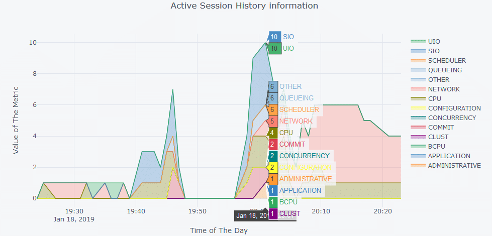
A more sophisticated graph is shown in Figure 6 for Active Session History information using plotly. OEM offers these features, however, Python plotting allows us to customize the graphs per our requirement. The same can be achieved in many ways by using a variety of visualization tools most of which are licensed. Figure 6 shows the Pythonic way of doing it for free.
Code:
import cx_Oracle
import pandas as pd
%matplotlib inline
from plotly.offline import download_plotlyjs, init_notebook_mode, plot, iplot
import plotly.graph_objs as go
import cufflinks as cf
init_notebook_mode(connected=True)
cf.go_offline()
try:
con = cx_Oracle.connect(‘python/[email protected]/XE’)
sql=”’SELECT sysmetric_history.sample_time,
cpu/60 AS cpu,
bcpu/60 AS bcpu,
DECODE(SIGN((cpu+bcpu)/60-cpu_ora_consumed), -1, 0, ((cpu+bcpu)/60-
cpu_ora_consumed)) AS cpu_ora_wait,
scheduler/60 AS scheduler,
uio/60 AS uio,
sio/60 AS sio,
concurrency/60 AS concurrency,
application/60 AS application,
COMMIT/60 AS COMMIT,
configuration/60 AS configuration,
administrative/60 AS administrative,
network/60 AS network,
queueing/60 AS queueing,
clust/60 AS clust,
other/60 AS other
FROM
(SELECT
TRUNC(sample_time,’MI’) AS sample_time,
DECODE(session_state,’ON
CPU’,DECODE(session_type,’BACKGROUND’,’BCPU’,’ON CPU’), wait_class) AS
wait_class
FROM v$active_session_history
WHERE sample_time>sysdate-INTERVAL ‘1’ HOUR
AND sample_time<=TRUNC(SYSDATE,’MI’)) ash
PIVOT (COUNT(*) FOR wait_class IN (‘ON CPU’ AS cpu,’BCPU’ AS bcpu,’Scheduler’
AS scheduler,’User I/O’ AS uio,’System I/O’ AS sio,
‘Concurrency’ AS concurrency,’Application’ AS application,’Commit’ AS
COMMIT,’Configuration’ AS configuration,
‘Administrative’ AS administrative,’Network’ AS network,’Queueing’ AS
queueing,’Cluster’ AS clust,’Other’ AS other)) ash,
(SELECT
TRUNC(begin_time,’MI’) AS sample_time,
VALUE/100 AS cpu_ora_consumed
FROM v$sysmetric_history
WHERE GROUP_ID=2
AND metric_name=’CPU Usage Per Sec’) sysmetric_history
WHERE ash.sample_time (+)=sysmetric_history.sample_time
ORDER BY sample_time”’
cursor = con.cursor()
ash_graph = pd.read_sql_query(sql,con)
except cx_Oracle.DatabaseError as exc:
err, = exc.args
print(“Oracle-Error-Code:”, err.code)
print(“Oracle-Error-Message:”, err.message)
finally:
cursor.close()
con.close()
pivot_ash = pd.pivot_table(ash_graph,index=[“SAMPLE_TIME”])
pivot_ash.iplot(kind=’area’,fill=True,mode=’lines’,xTitle=’Time of The Day’,yTitle=’Value of
The Metric’,
title=’Active Session History information’)
Heat Maps
An interesting way to understand the intensity of an action is to make use of heat maps. This can be used in many ways, one such is shown in Figure 7. In our case, the archive generation rate is depicted as a heat map where the more archives generated, the redder the block of the map. This concept can further be extended and used extensively in the administration work, especially when monitoring performance of the database, applying filters to narrow down the analysis to a specific performance metric, or analyzing the resource consumption.
In this example, we will read the archive generation data from an Excel sheet into a Pandas DataFrame. Perform a transformation on hours column and create a pivot table. Once the pivot table is created, we fill in the null rows with the float value 0.0 (another example of data cleaning) to show no archives were generated during that time frame.
Code:
from plotly.offline import download_plotlyjs, init_notebook_mode, plot, iplot
import plotly.graph_objs as go
import cufflinks as cf
init_notebook_mode(connected=True)
cf.go_offline()
#Read archive generation data from the excel sheet into a Pandas DataFrame
arch_gen_file = pd.read_excel(‘arch_gen.xls’,parse_dates=[‘HOUR’])
#Preprocessing the data to change the Hours(Date) columb to Date and Time columns
arch_gen_file[‘Date’] = [d.date() for d in arch_gen_file[‘HOUR’]]
arch_gen_file[‘Time’] = [d.time() for d in arch_gen_file[‘HOUR’]]
arch_gen_file.drop([‘HOUR’], axis=1,inplace=True)
#Creating a Pivot Table
arch_gen_file_matrix = arch_gen_file.pivot(“Date”, “Time”, “ARCHIVES”)
arch_gen_file_matrix = arch_gen_file_matrix.fillna(0.0)
arch_gen_file_matrix.head()
#Preparing Data for HeatMap
dates_list = arch_gen_file_matrix.index
time_list = arch_gen_file_matrix.columns
z = arch_gen_file_matrix.values
data = [
go.Heatmap(
z=z,
x=time_list,
y=dates_list,
colorscale=’Portland’,
)
]
layout = go.Layout(
title=’Archive Generation History’,
xaxis = dict(ticks=”, nticks=36),
yaxis = dict(ticks=” )
)
fig = go.Figure(data=data, layout=layout)
iplot(fig)
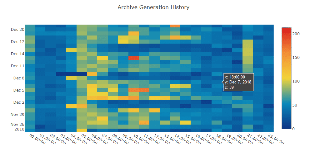
As the intensity of the action increases, the data point associated with the operation changes its color according to the color mapping defined. In our case, this is red, showing more activity being done. This is no replacement for the regular SQL queries a DBA uses. However, understanding what’s happening via visualizations is much easier than going through lines of textual information – after all, a picture is worth a thousand words.
Pivot Tables
Pivot tables are not new to anyone with experience in data analysis, and DBAs are no exception. Python’s Pandas library offers a feature to do this, similar to Excel sheets.
Here is what we did:
Extracted the hourly archive generation data from the database and loaded into a DataFrame as shown in Figure 8. The HOURS column is then transformed into separate Date and Time columns to make the plotting and analysis easier as shown in Figure 9. This is called feature creation, another important aspect of data analysis. Finally, the dataset is converted into a pivot table, represented in Figure 10.
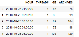
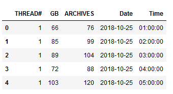

This pivot table is then used as an input to the heat map generated above. Pivot tables are most commonly used in data analysis which helps visualize the data in a better textual/tabular format, which upon combining with plotting libraries can create magnificent graphs.
Conclusion
While OEM does ship with a ton of features tailored to meet the DBA’s requirements, Python is just another tool to analyze data and create graphs per our requirement – and it’s free. Apart from offering a wide range of options in the form of different plotting libraries, Python’s SciPy can be used to implement Machine Learning models, as well. Also, most of the automation done using shell scripting can also be done using Python. It shines where shell lacks in generating graphs. Creating the machine learning models and implementing automation is beyond the scope of this article, but this just suggests a need to learn Python to make the DBA’s work more creative and interesting.
About the Author

Rohith Solomon is a Senior Oracle Database Administrator for Hitachi Consulting. He has over six years of experience as the Oracle DBA. Prior to this, he worked as an intern Java programmer. Solomon finds joy in exploring concepts related to big data, machine learning, and algorithms. He holds a bachelor’s degree in computer science and engineering. He can be reached at [email protected]. For more of his work on Python visualization and machine learning, visit https://datasoups.blogspot.com/.
